

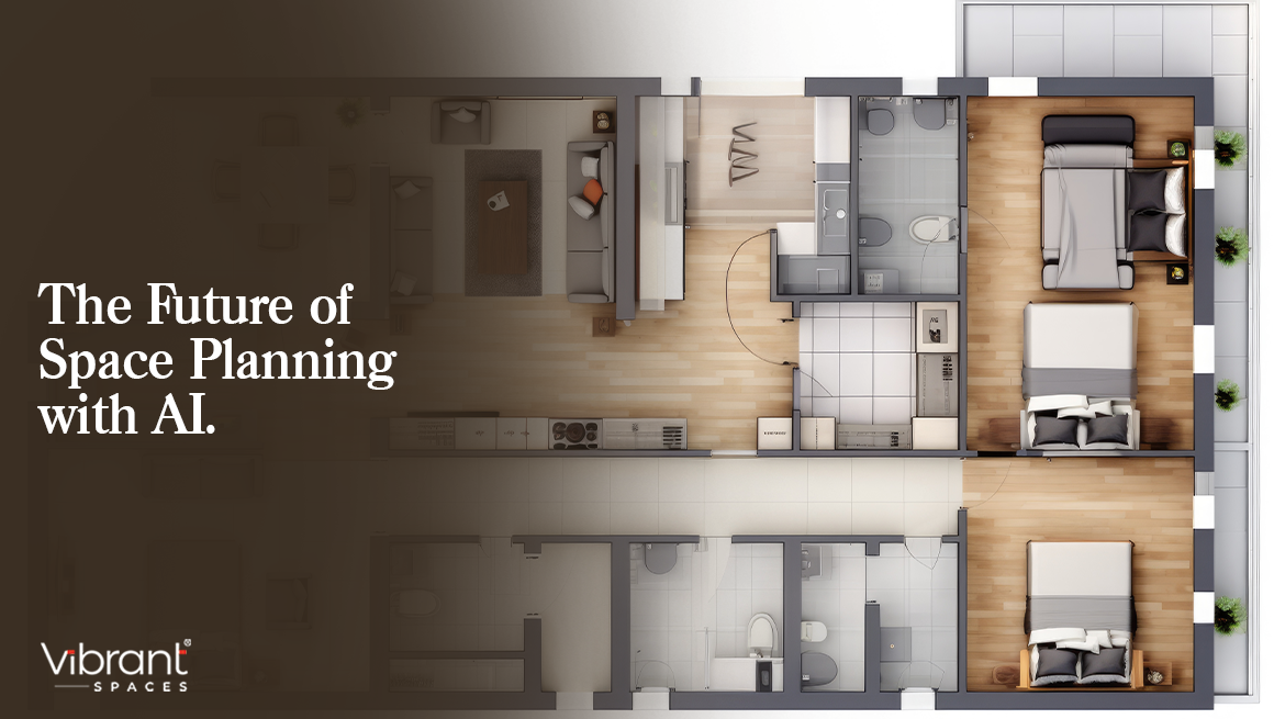
When you pick up a lifestyle magazine and browse through the home section, the vibrant hues splashed across the pages are probably the first thing that catch your eye. Without a doubt, colours set the mood of a home. Bright and bold hues can create a vibrant atmosphere while subtler shades can make you feel calm and relaxed. Choosing the wrong colours, or using clashing tones can wreck a home’s vibe. Want to get the delicate dance of colour right every time? Our interior designers have put together a handy guide on how to choose the best colour combinations for home interiors.
- Start with the Colour Wheel

Image Courtesy: Pinterest
As children, we all learn about the colour wheel. And you’ve certainly had lessons on primary, secondary and tertiary colours. Your home interiors are a great place to put that knowledge to good use! The colour wheel functions as a visual guide on what shades work together. It juxtaposes the 12 basic hues against each other, and more complex versions show how different shades can come together for the best colour combinations for your home. You can use this to decide your wall paints, furniture and other accessories in your space.
- Use the 60-30-10 Rule
The 60-30-10 is one of the oldest decorating rules in the book. It dictates that your main or anchor colour should take up 60% of the room, which is most often your wall colour. Next, 30% of your room should have a contrast colour or one that complements your dominant colour, depending on how daring you’d like to get. This sets your colour palette, and makes your space feel more cohesive. Furniture or an accent wall is a great way to incorporate this. A third shade should take up just 10% of the room, perhaps as curtains, decorative objects or lamps — the final touch to tie your room together.
- Pick a Colour Scheme
There are different colour schemes you can choose for your home.
In a monochromatic colour scheme, you would opt for a single base colour and different tinges of the same for the whole room or house. For instance, if you choose grey, you could have dark grey accent walls and lighter shades of grey or cream on the other walls. Your furniture and décor should also play into this theme.

A complementary scheme is created using hues and tints of two colors that are on opposite sides of the colour wheel. For instance, if you choose blue and orange, add several shades of these across the room. Or, you could do the same with muted shades of green and pink for a subtler feel.
A split complementary scheme would use three instead of two colours. Pick a base shade, find a colour that complements it, and then use two colours on either side of your selection. For instance, blue-green are complementary colours, with red-orange being splits. Use a combination of these across the room.
If you’d prefer to use an analogous colour scheme in your home, mix colours adjacent to each other on the colour wheel for a harmonious mood. It’s best to stick to three or four colours to avoid a jarring result.

Image Courtesy: Pinterest
- Use Neutrals to Tone Things Down
While it can be tempting to go wild with colour, incorporate neutrals for a balancing effect. Too many bright colours can throw the interiors of a house askew. Beige and cream are neutral shades that work with almost all colours. Incorporate them on ceilings, decorations and other artefacts in your home.
Take the Hint
Choosing the right colours can impact how your home feels. If you are unsure of what works best, talk to the best interior designers in Chennai at Vibrant for the best colour combinations for home interiors that will match your style.


Leave A Comment